Interior Designers' Sites: 5 Features That Make a Lasting Impression
A beautifully designed interior can capture someone's attention in an instant. The materials, proportions, lighting, and carefully considered details all contribute to the experience of a space.
Your website has a similar opportunity.
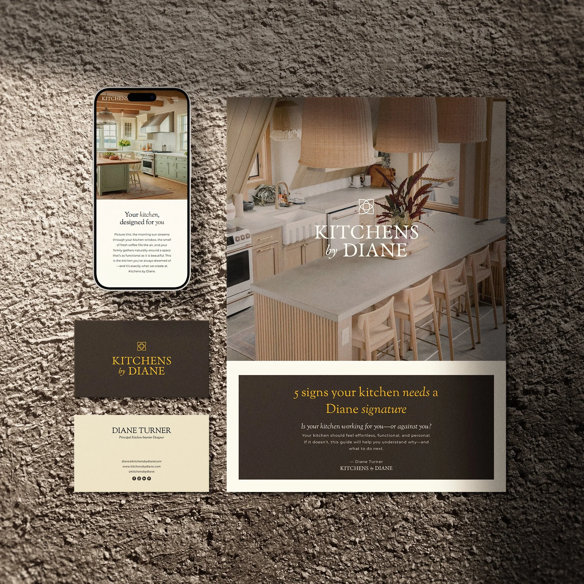
For interior designers, a website is more than a place to display finished projects. It's an introduction to your studio, your creative perspective, and the experience clients can expect when working with you.
A prospective client might discover your studio through a project photograph, a recommendation, or a search for design inspiration. When they visit your website, they begin looking for answers. Does your work align with their taste? Do you offer the services they need? Can they understand your approach and picture themselves working with you?
The most effective interior designers sites answer these questions through a thoughtful combination of photography, messaging, navigation, and visual identity.
But what separates a memorable website from one that simply looks attractive?
Whether you're building a new website or considering a refresh, here are five features worth examining when exploring sites for interior designers and deciding what your own website needs to accomplish.
1. What makes the first impression of an interior design website effective?
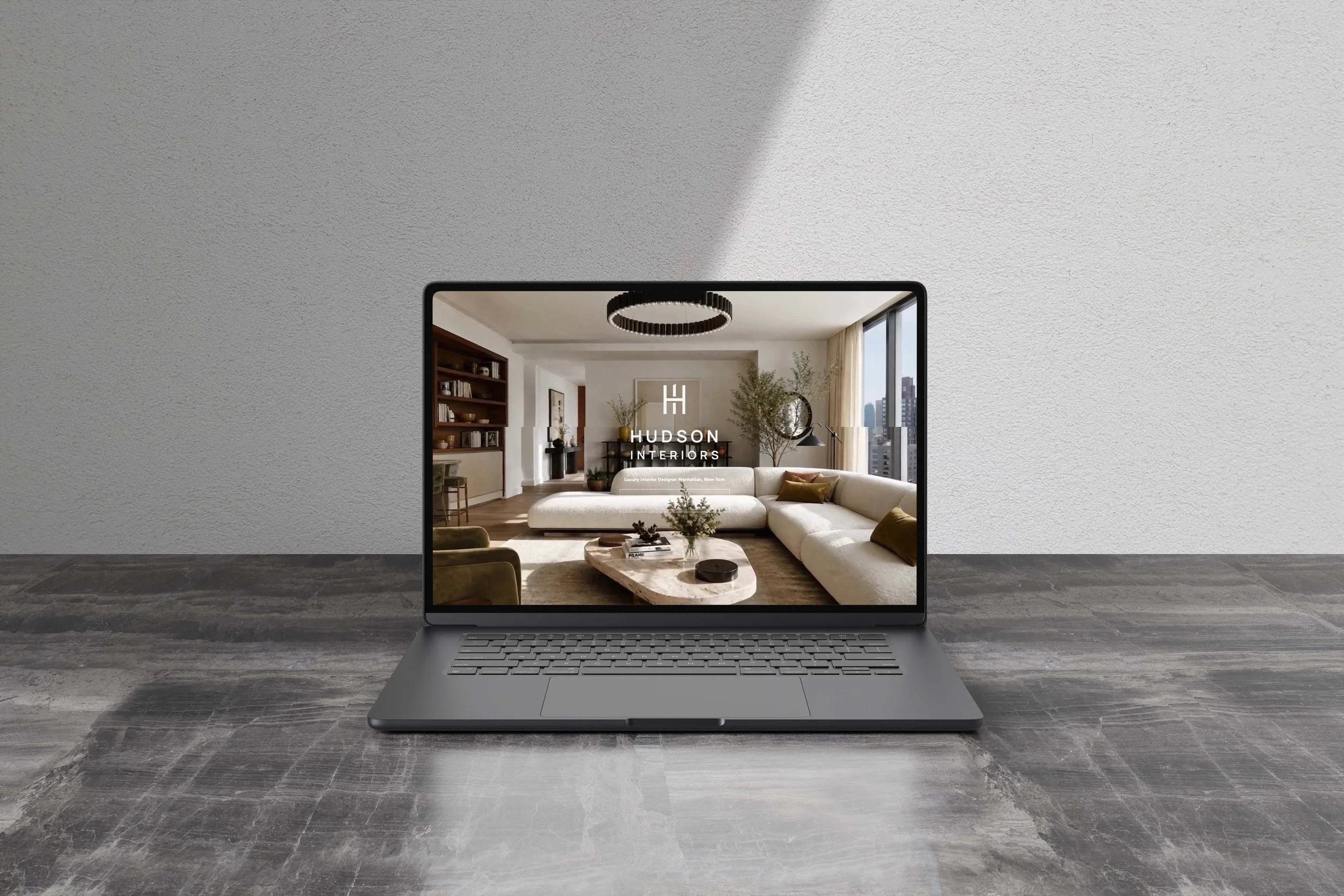
A strong homepage gives visitors an immediate sense of the studio's aesthetic and approach.
This doesn't necessarily require an elaborate animation, a complicated layout, or a long introduction. Sometimes, a carefully selected project image, clear typography, and a concise statement about the studio are enough to establish the right impression.
The key is intentionality.
Your opening image should represent the kind of work you want to be known for. Your headline should help visitors understand the studio's focus, while your navigation should make it easy to explore the rest of the website.
These elements work together to create a first impression before visitors have read every detail.
When exploring the best interior design websites, notice how the homepage balances visual impact with useful information. Some websites lead with a full-width project photograph, while others introduce the designer's perspective through a more editorial layout. Both approaches can work when they support the studio's identity.
Consider how much information appears immediately and what is revealed as you scroll. A thoughtful homepage gives visitors enough context to become interested without overwhelming them with every service, project, and detail at once.
For your own website, begin by identifying the most important thing a new visitor should understand about your studio.
You might want them to recognize your focus on full-service residential design, understand your approach to renovations, or appreciate the character of your portfolio. Let that priority guide your opening image, headline, and primary navigation.
A strong first impression doesn't need to communicate everything. It needs to give the right people a reason to keep exploring.
2. How should project photography be presented?
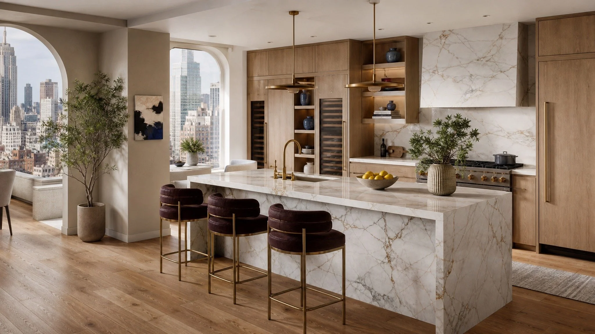
Photography is often the heart of an interior design website. It allows prospective clients to experience a designer's work before arranging a consultation.
However, showcasing a portfolio involves more than uploading a collection of beautiful images.
The way projects are selected, organized, and presented influences how visitors understand your work.
Start with curation. Choose projects that reflect your studio's design perspective and the kind of work you want to attract. A focused collection can communicate a clearer point of view than a gallery containing every completed room without distinction.
Think about the balance of images, too. Wide photographs establish the architecture and layout of a space. Closer views reveal materials, finishes, and decorative details. Together, they give visitors a more complete understanding of the project.
The sequence matters as well. A carefully arranged gallery can guide someone through a space, moving from an overall impression to the details that make the design distinctive.
Project pages also benefit from context.
Rather than presenting photographs without explanation, introduce each project with a short description of the client's goals, the challenges involved, and the ideas that shaped the final result.
You might explain how a layout improved daily living, why a particular material was selected, or how the palette connects different areas of the home.
These details help visitors understand the thinking behind the finished interior.
When reviewing interior designers sites, look for examples where photography and storytelling complement one another. Notice how the designer balances images with text, whether project descriptions are easy to scan, and how visitors move between projects.
For your own portfolio, prioritize quality, relevance, and a cohesive presentation. Your website should help visitors understand not only what your work looks like, but also what makes your approach distinctive.
3. How can a website communicate a studio's personality?
Two interior design studios may produce equally beautiful work while offering very different experiences.
One might specialize in relaxed, layered homes filled with collected objects. Another might focus on contemporary architecture, restrained materials, and clean lines. Their websites should reflect those differences rather than follow an identical formula.
Look at how typography, colors, spacing, imagery, and written content work together.
A studio's personality often emerges through the combination of these details rather than any single design choice.
For example, a more editorial approach might use expressive typography, generous whitespace, and carefully paced photography. A studio with a warmer, more personal identity might use softer colors, inviting imagery, and approachable language.
Neither direction is inherently superior. The important thing is that the visual presentation feels consistent with the studio's work and values.
The written content is equally important.
An about page should explain more than when the business was established. It can introduce the designer's philosophy, describe the kinds of projects they enjoy, and help visitors understand what makes their approach distinctive.
Likewise, a services page should communicate what clients can expect rather than relying entirely on broad promises about creating beautiful spaces.
Specific language creates a clearer impression. Explaining your process, the challenges you help solve, and the clients you serve gives visitors more useful information than generic statements alone.
This is where branding and website design meet. When the visual identity, photography, and messaging share a clear direction, the website becomes more recognizable and memorable.
As you explore sites for interior designers, pay attention to how each studio expresses its identity. Instead of copying a layout simply because it looks attractive, ask what makes it appropriate for that particular business.
Then consider how similar principles could support your own studio without losing what makes it unique.
4. What website navigation makes it easier for visitors to explore?
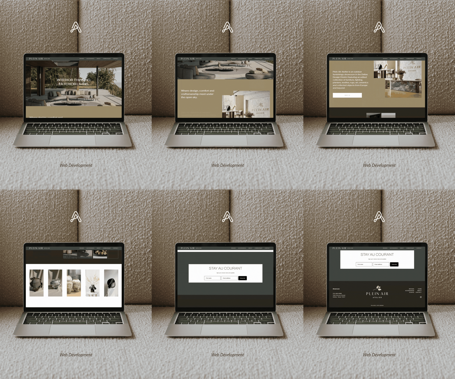
Even the most beautiful website can become frustrating when visitors struggle to find what they need.
Clear navigation helps people move naturally between your portfolio, services, about page, and contact information.
Start by keeping the main navigation focused on the pages visitors are most likely to need. Use straightforward labels and avoid making people guess where important information lives.
Your portfolio should be easy to browse, and individual project pages should provide a clear way to return to the main gallery or explore another project.
Your services page should explain the scope of your work, while your contact page should make the next step easy to understand.
It's also worth considering how visitors move through the website as a whole.
Someone who discovers a project through a search might want to learn about the studio. A visitor who reads your about page may then want to explore your services. A prospective client reviewing your services might be ready to inquire.
Thoughtful internal links help connect these steps without forcing visitors to return to the navigation menu each time.
Mobile usability deserves the same attention. Images should display appropriately, text should remain comfortable to read, and navigation should be easy to use on smaller screens.
When evaluating the best interior design websites, don't focus exclusively on appearance. Explore the site as if you were a prospective client.
Can you understand the services? Can you find relevant projects? Is it clear how to get in touch? Does the experience remain comfortable on a mobile device?
A well-organized website respects the visitor's time and allows the work to speak for itself.
5. How does a beautiful website encourage the right inquiries?
A portfolio can attract attention, but prospective clients also need to understand whether your studio is right for their project.
This is where thoughtful calls to action and clear service messaging become important.
Rather than placing a generic contact button everywhere, consider what the visitor needs at each stage.
Someone exploring your homepage may want to learn more about your studio. A visitor reading a project case study may be ready to explore your services. Someone who has reviewed your process may be prepared to inquire.
Give each page a logical next step.
For example, a project page might link to your services page, while your services page could invite visitors to discuss an upcoming project. Your about page might encourage readers to explore the portfolio to see how your design philosophy translates into finished spaces.
Your inquiry page can also set expectations by explaining what information to share, what types of projects you accept, or what happens after someone submits the form.
These details help create a smoother experience for both the prospective client and the studio.
Your messaging should also help visitors understand the value of your services. Beautiful imagery may attract attention, but clear descriptions explain the expertise, planning, and collaboration behind the work.
A website should make it easy for visitors to understand what you offer and decide whether they want to take the next step.
This doesn't mean every page needs a sales pitch. A thoughtful call to action simply gives interested readers a clear path forward when they're ready.
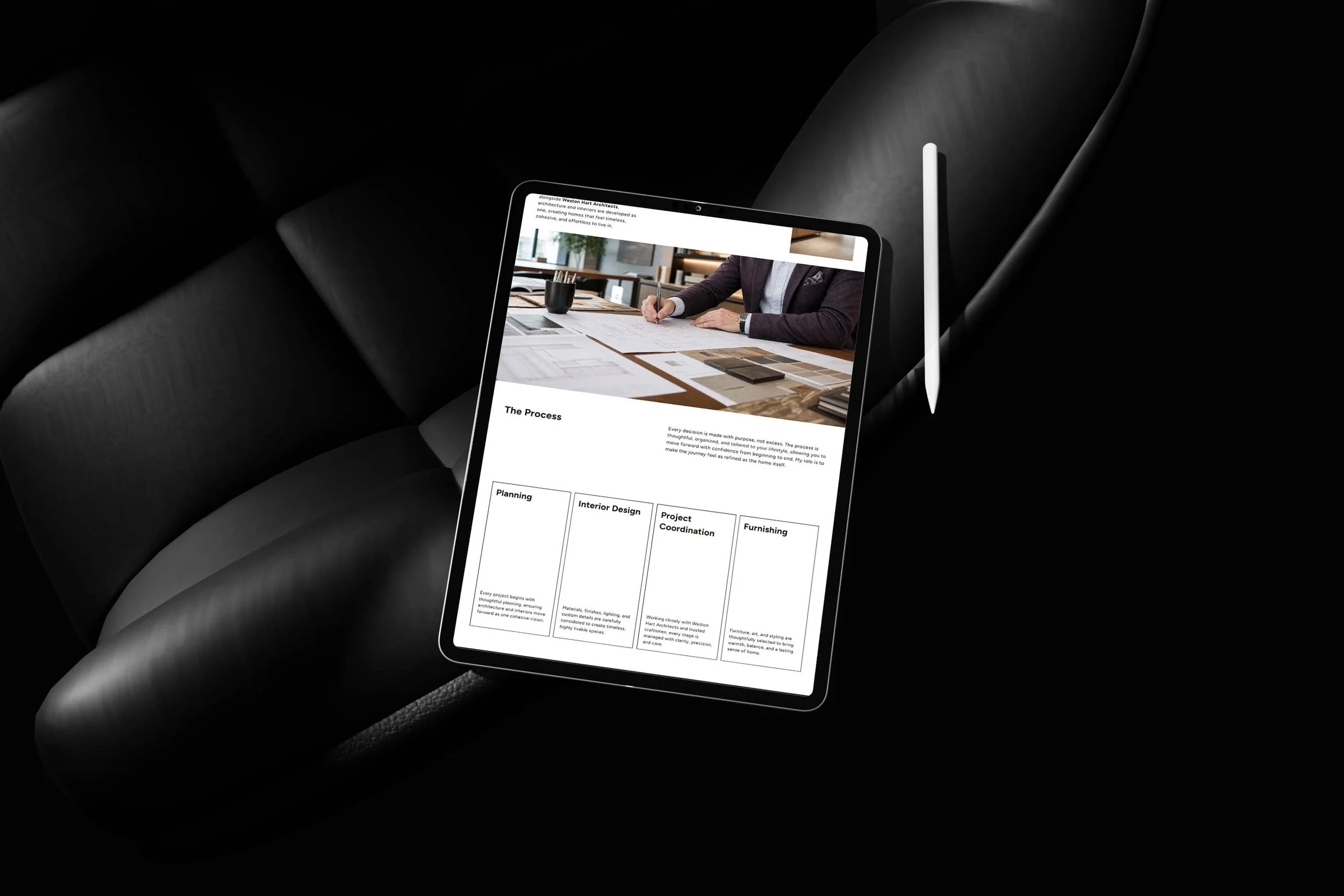
Bringing Your Interior Design Website Together
The best interior design websites aren't necessarily the ones with the most elaborate features or the largest portfolios. They're the ones that combine strong visuals with a clear sense of identity, useful information, and a thoughtful visitor experience.
As you gather inspiration, look beyond individual design trends. Pay attention to how each website communicates the studio's perspective, organizes its work, and helps potential clients understand the services.
Then consider what your own website needs to accomplish.
Perhaps your portfolio needs stronger project storytelling. Perhaps your branding no longer reflects your work, or your services are difficult to understand. Maybe visitors can explore your projects but struggle to find the next step.
Start by identifying the parts of the experience that feel disconnected. You don't necessarily need to redesign everything at once. Improving your navigation, refining your project descriptions, or clarifying your messaging can be a useful starting point.
The most important thing is to approach your website as a connected experience rather than a collection of individual pages.
Your homepage introduces the studio. Your portfolio demonstrates your work. Your about and services pages provide context. Your contact page helps interested visitors take the next step.
When these elements work together, your website can communicate the thought, expertise, and personality behind your interiors.
Your website should do more than display the spaces you've created. It should help visitors understand the designer behind them and feel confident exploring what working with your studio might look like.
If your current website no longer reflects the quality or direction of your work, it may be time to reconsider how everything fits together.
Explore The Art of You's website design services to learn how thoughtful branding, portfolio storytelling, and website strategy can come together in a cohesive digital experience.